overview
design data visualizations for a dashboard and expand its functionality
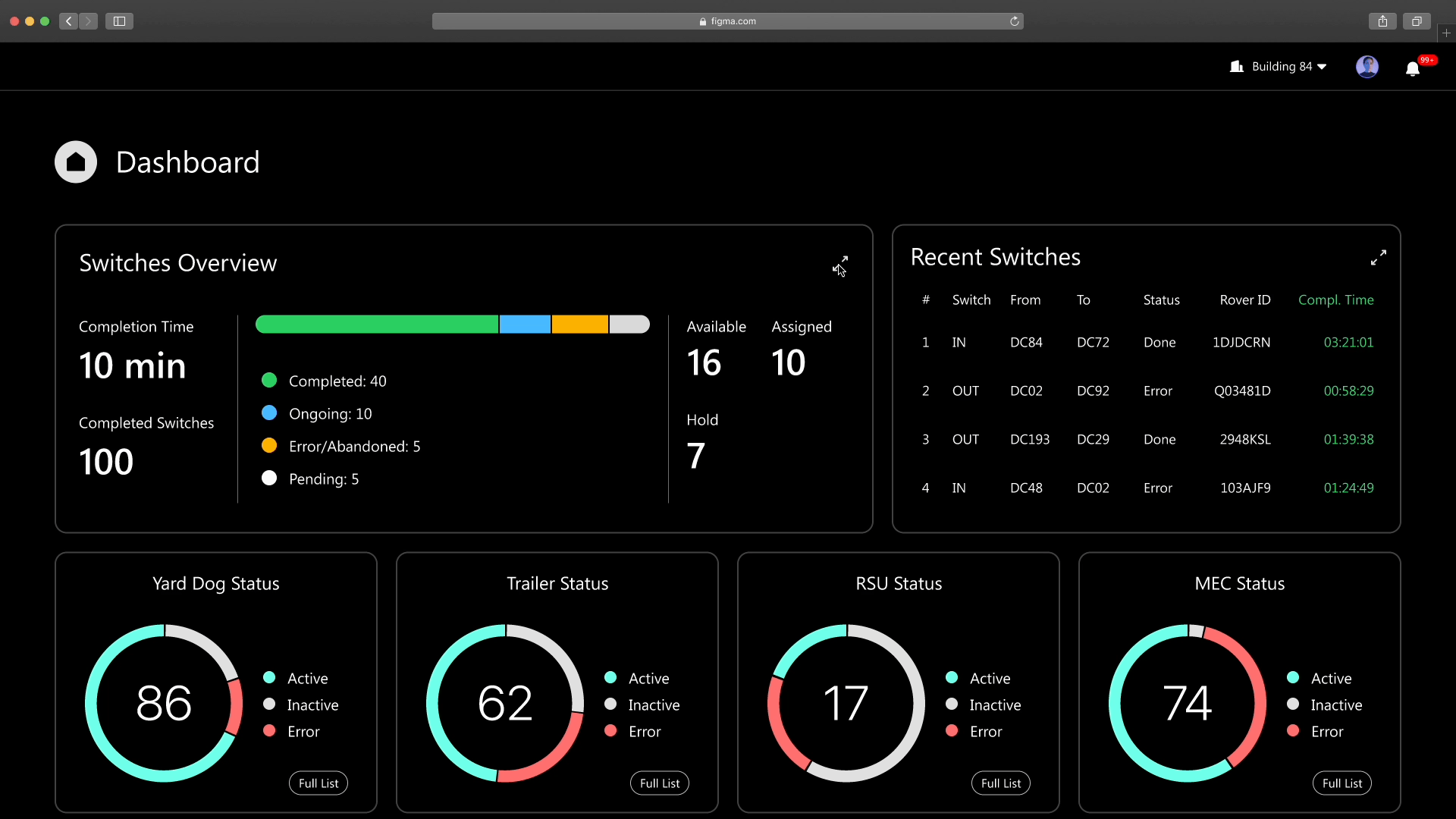
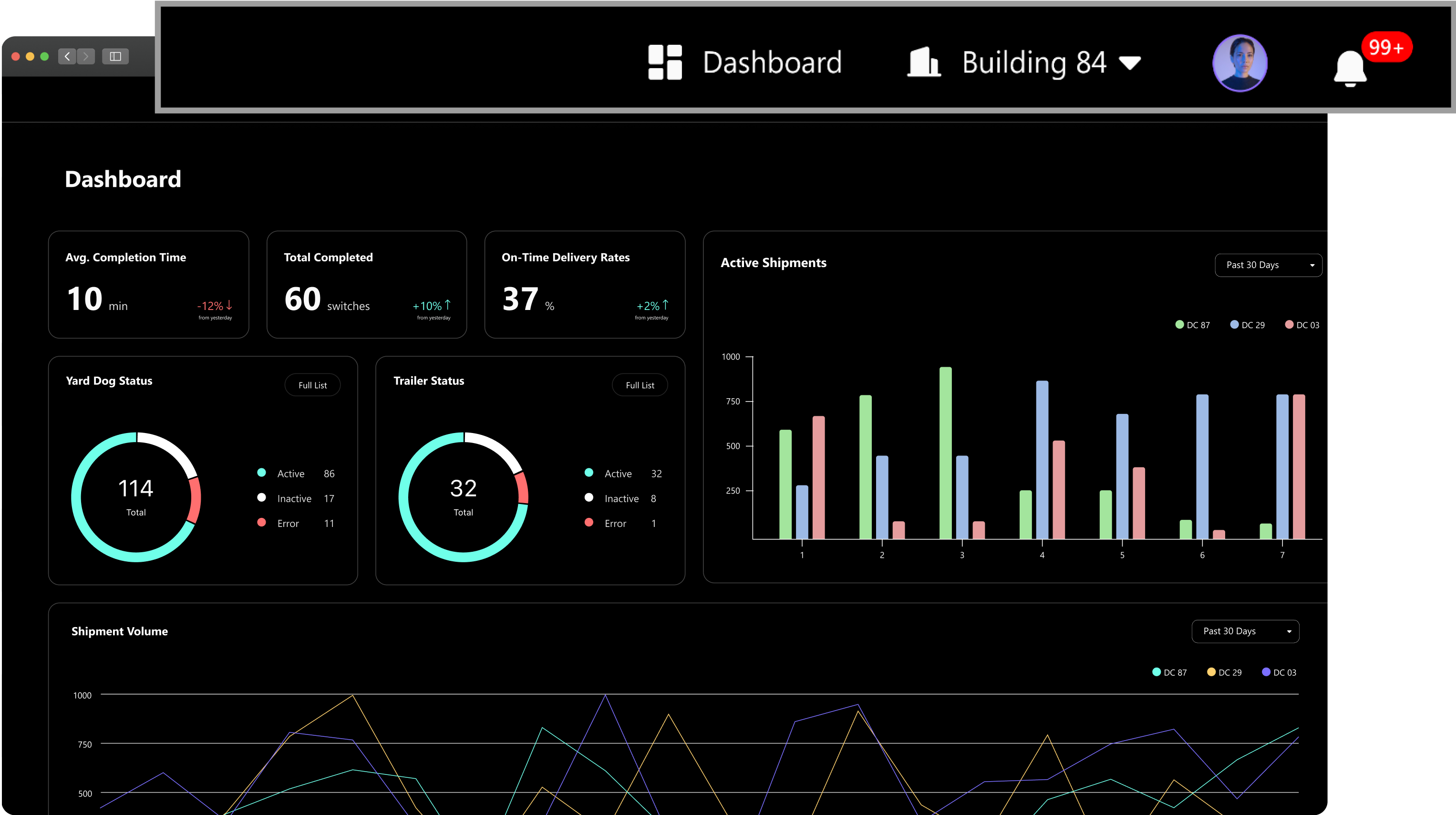
During my internship at Mitsubishi Electric Automotive America (MEAA), I led the design of 13 features and maintained the design system for an autonomous logistics platform, which served as the control center for autonomous yard vehicles. For this case study, I will focus on the design of the dashboard.
The product was launched in Sep 2024.
why dashboard?
The dashboard is a new and advanced feature to help user review system performance and make decisions. I redesigned the visuals and user flows of the new dashboard to enhance data readability and accessibility.
timeline
Jul 2023 - Aug 2023
(1 month)
(1 month)
role
UX / UI Designer
team
Product Manager / 1
Software Engineers / 3
UX Designers / 2
Software Engineers / 3
UX Designers / 2
target users & problems
Scattered data and fragmented communication are the main pain points for dispatchers and business clients


" I am on the move from time to time, so trying to sift through pages of text and data under that situation is a real pain.”
" I felt overwhelmed by the many channels and the different people I needed to communicate with in each one.”
" I have to jump between different systems and screens to find the information I need, and it takes a lot of time and effort.”
design challenge
How might we make data more accessible and empower users to take effective action?
final designs
1. Create data visualization to enhance data readability

2. Implement dark mode to reduce eye strain and improve data readability

3. Provide real-time communication with side-panel chat

4. Side bar access for consistency and scalability

success metrics
Dashboard Usage Frequency
Tracks how often dispatchers engage with the dashboard
Inquiry response time
Measures the speed at which dispatchers respond to incoming inquiries.
Time to Issue Resolution
Evaluate the time taken to identify and respond to issues.
Route Optimization Efficiency
Measures the reduction in time for dispatchers to assign and adjust routes
design process
1. Create data visualization and information hierarchy to enhance data readability
1. Offer varied visualizations, and use color and font weights to improve data readability


2. Implement interactive states for enhanced chart visibility
• Highlight selected information
Active
Default
• Floating box for detail information
Active
Default
3. Creat consistent, scalable, and easy-to-build layouts
When there are a huge amount of data, how to layout these visualizations? I created two different versions for testing.
Version 1
Expandable grids
Concise, but cause confusion
Version 2
Flat grids
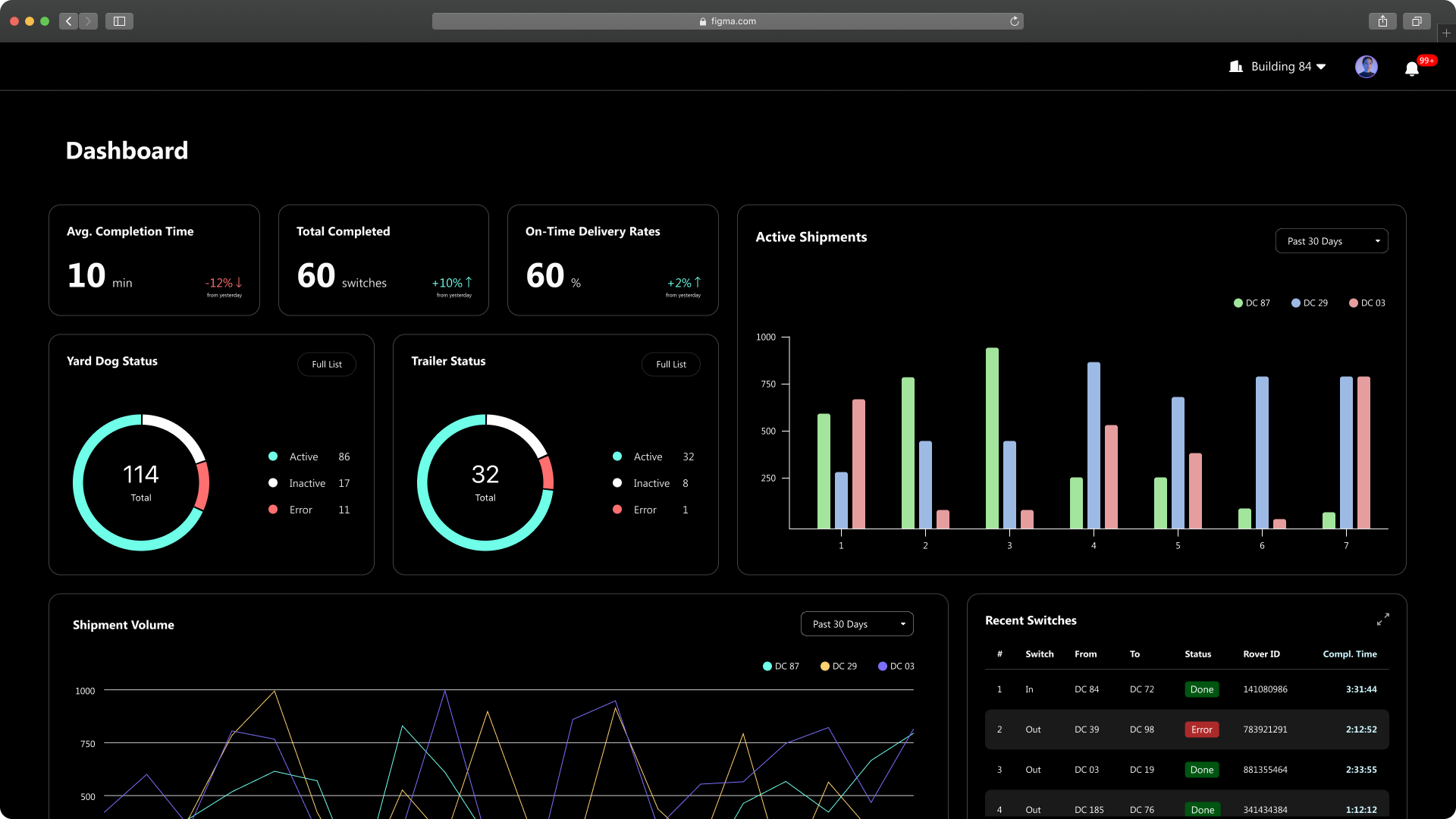
Scalable, but less concise
While version 1 presented data more concisely, the shifting layout from expandable grids led to confusion and reduced scalability. We chose the simplicity of version 2, displaying all data upfront.
2. Implement dark mode to reduce eye strain and improve data readability
Why dark mode?
Our research showed that dispatchers work in dimly lit environments, so we implement dark mode to enhance viewing comfort. This mode also aligns well with Mitsubishi's brand identity.
Create a cohesive palette for different modes
Based on the primary and accent colors, I chose background colors that complemented them. Finally, I refined the colors in both dark and light modes to ensure they met WCAG 2.1 AA accessibility standards for visualizations.


3. Embedded chat in the dashboard for real-time communication
Why side-panel chat?
Fragmented communication is a major issue for our users, as switching between different channels disrupts workflow and reduces efficiency. By integrating an in-screen chat within the dashboard, users can instantly take action on insights without needing to switch contexts, streamlining their process and improving productivity.
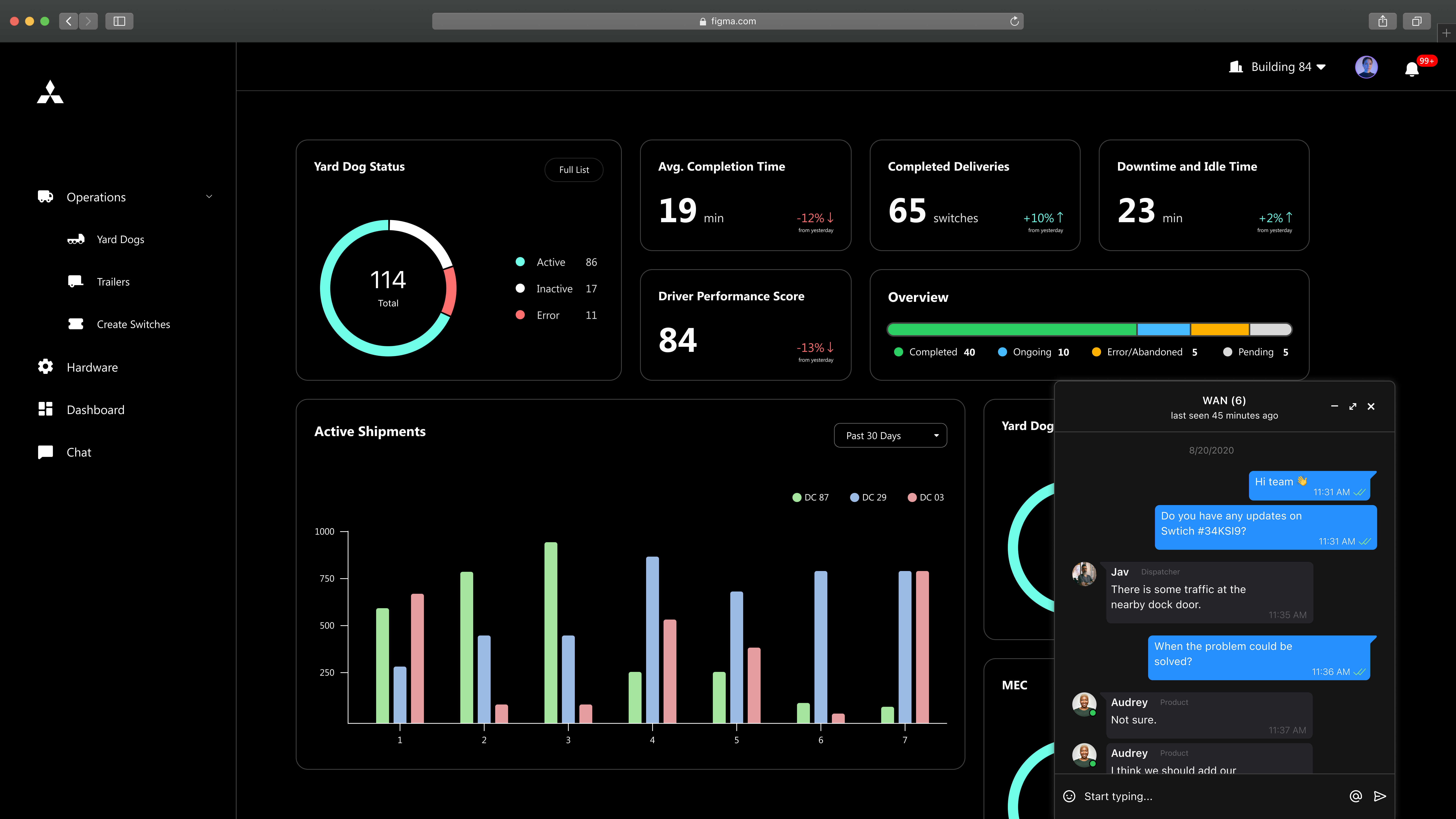
Minimized Chat
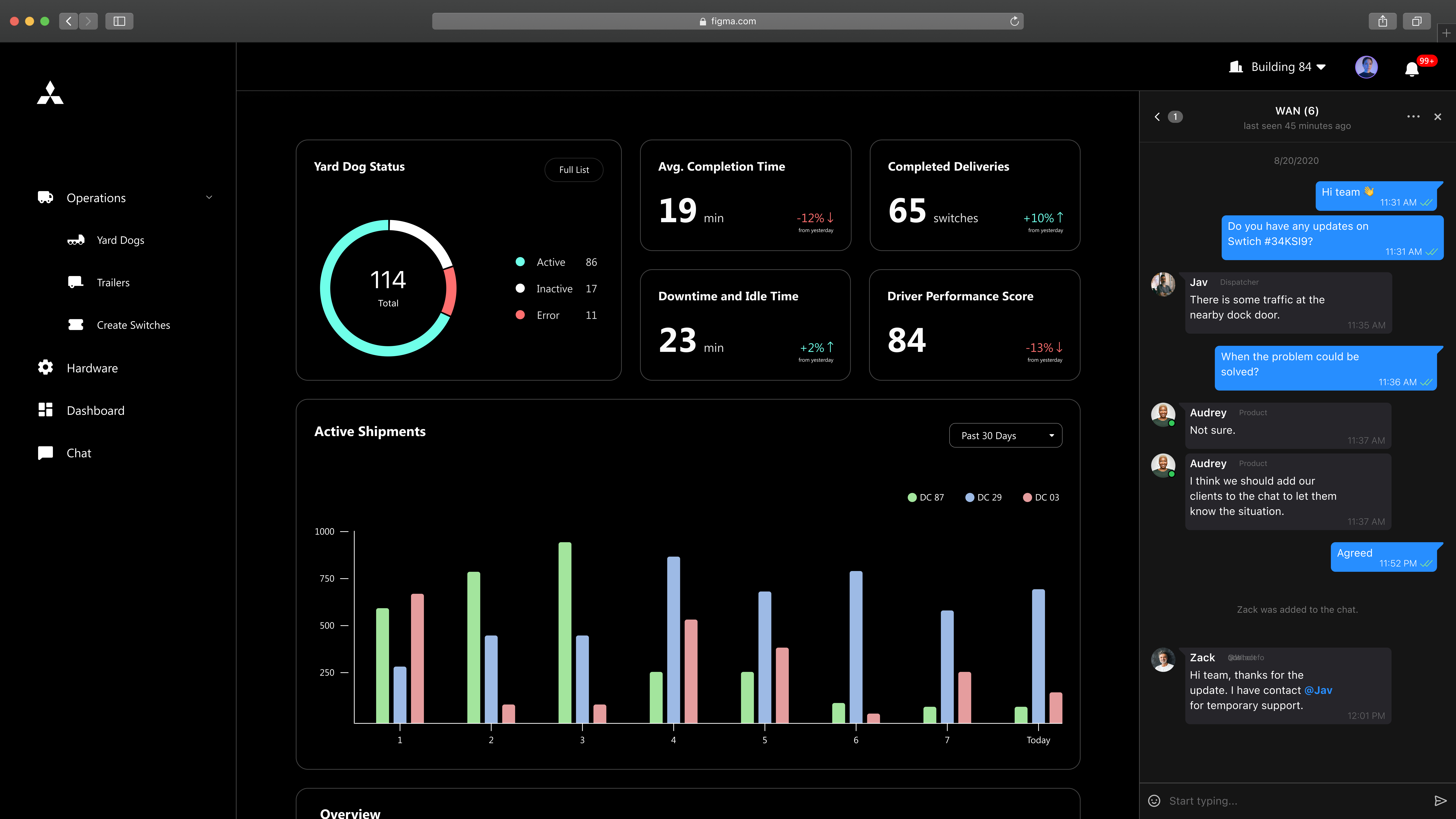
Side-panel chat
4. Side bar access for consistency and scalability
Be fast or be consistent?
After evaluating the options, we decided on a side panel instead of a top bar for dashboard access. While the top bar offers quicker access with fewer clicks, the side panel provides better consistency by consolidating all features in one place. It also offers greater scalability for future additions.
Version 1
Top bar access
Ubiquitous access, but less scalability and consistency
Version 2
Side bar access
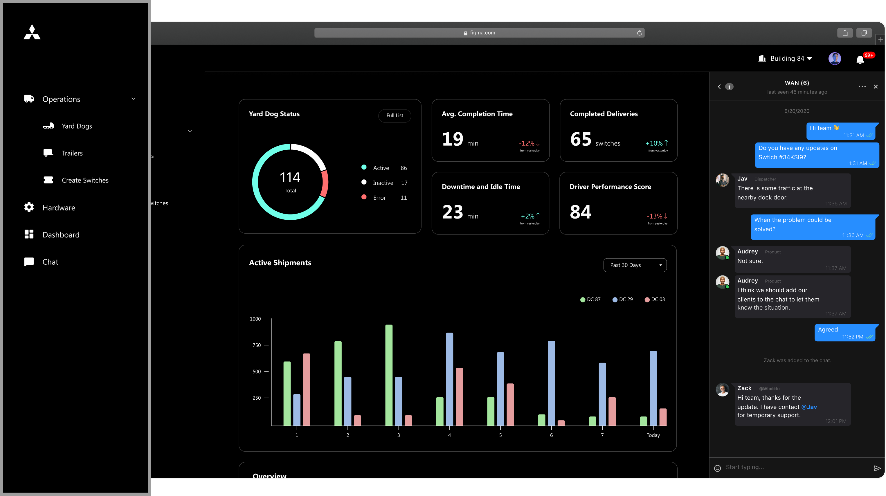
More clicks are needed, but is more consistent and scalable
lessons learned
- There is no wrong design but only the most appropriate answer given the scenariosWhen each option valid, how to know which decision is correct? I learned that there is no correct design. Designers should consider use cases and scenarios to make context-driven decisions.
- Effective Communication in Design PresentationsIn presenting my design to engineers, a product owner, and a project manager, I learned the key aspects to communicate effectively. Rather than just layouts, I emphasized design changes and their rationale, along with user flows and system performance across scenarios.
- Balancing Innovation with Development Efficiency in DesignWhile designing the dashboard, the engineering team initially opposed my dynamic block design due to anticipated development effort. However, I clarified the rationale, scenarios, and user benefits. To alleviate concerns about time, I established guiding principles to streamline development.